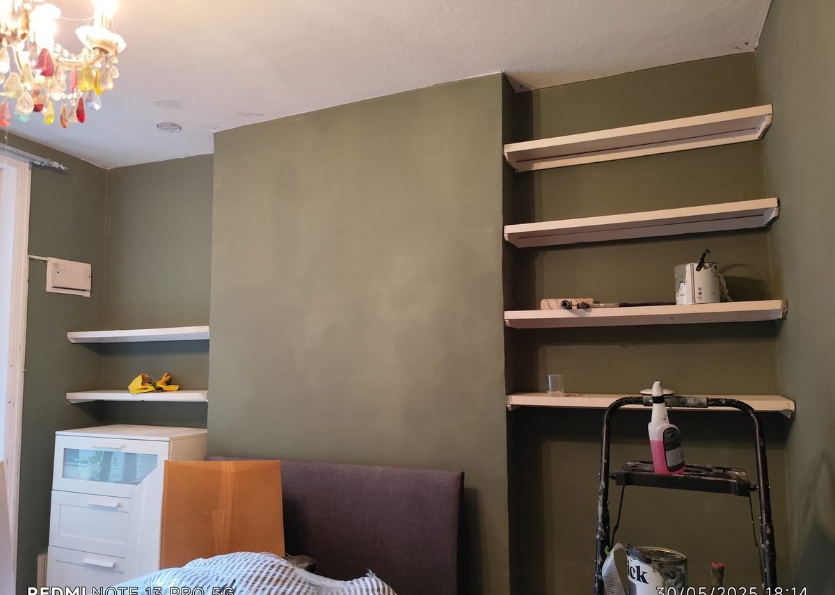
Choosing paint for a small London flat is a different game to decorating a big house in the suburbs.
You’ve got less wall, less light, and usually a layout that was never designed around “open-plan living.” Add Victorian plaster, a north-facing living room, and a hallway that never sees the sun — and the wrong colour doesn’t just look “a bit off.” It makes the whole place feel smaller.
I’ve painted studios, one-beds and family flats across SE17, Walworth, Camberwell, Peckham and beyond for years. Here’s how I help clients pick colours that actually work in small London homes — not just on a Pinterest board.
1. Start with the light, not the tin
Before you fall in love with a shade, stand in the room at different times of day.
- South-facing rooms get warmer light. Cool greys and soft blues usually behave well.
- North-facing rooms get colder light. Pure greys can look muddy; warm neutrals and soft stone tones usually feel better.
- East-facing rooms are brighter in the morning, cooler later.
- West-facing rooms warm up in the evening — great for soft terracotta and muted greens.
In a small flat, light is everything. A colour that looked calm in a big, bright showroom can feel gloomy in a 3-metre-wide London living room.
Pro tip: Sample on at least two walls — one near the window, one deeper into the room. Live with it for a couple of days before you commit.
2. Small rooms don’t always need “light and bright”
People assume small = white. Sometimes that’s right. Often it isn’t.
Pale colours bounce light, which helps. But a tiny box room painted in a flat, cold white can feel clinical — especially with London’s grey winter light.
What often works better in small flats:
- Warm off-whites instead of brilliant white
- Soft stone / greige that doesn’t go blue in the evening
- One deeper accent wall behind a bed or sofa (not every wall)
- Same colour family on walls and woodwork for a calmer, bigger feel
If the room is already dark, don’t fight it with the coldest white on the shelf. Warm it up carefully instead.
3. Five palettes that work in small South London flats
These aren’t rigid rules — they’re starting points I use with clients when they want something safe, modern and liveable.
Palette A — Soft and airy
- Walls: warm off-white
- Woodwork: matching or slightly cleaner white
- Ceiling: same as walls (makes height feel less chopped)
- Good for: small living rooms, rented flats, north-facing bedrooms
Palette B — Calm greige
- Walls: warm light greige
- Woodwork: soft white
- Accent: deeper taupe on one wall or alcoves
- Good for: open-plan kitchen-living spaces
Palette C — Gentle sage
- Walls: muted sage green
- Woodwork: warm white
- Keep it soft — avoid anything too yellow or too minty
- Good for: bedrooms, bathrooms with decent light
Palette D — Quiet blue
- Walls: dusty blue-grey
- Woodwork: clean white
- Avoid icy blues in north-facing rooms
- Good for: studies, kids’ rooms, south-facing lounges
Palette E — Warm terracotta whisper
- Walls: soft clay / muted terracotta (light, not brick red)
- Woodwork: warm cream or off-white
- Use sparingly in the smallest rooms — beautiful in dining nooks and feature walls
- Good for: rooms that feel cold and need warmth
If you’re unsure, start with Palette A or B. You can always add stronger colour later on one wall once the flat feels settled.
4. Don’t forget woodwork, ceilings and “joinery”
In small London flats, skirting, doors, window frames and alcoves take up a surprising amount of visual space.
Common mistakes:
- Crisp brilliant-white woodwork against a muddy grey wall (harsh contrast in a tiny room)
- Leaving old yellowed gloss while refreshing the walls (the whole room still looks tired)
- Painting the ceiling a harsh white that fights the wall colour
A cleaner look in small spaces is often:
- Walls and woodwork in the same colour family
- Ceiling a touch lighter than the walls, or the same colour if the ceiling is low
- Doors finished properly — scuffed white doors will spoil an otherwise perfect colour scheme
5. Test properly (this is where most DIY jobs go wrong)
A 5cm swatch on a phone screen is not a test.
Do this instead:
- Buy a sample pot of your shortlist (2–3 colours max).
- Paint large squares (A3 / A4 at least) on lining paper or directly on the wall.
- Check morning, afternoon and evening light.
- Look at the sample next to your sofa, floor and kitchen worktop — not in isolation.
- Sleep on it. If you’re still unsure after three days, it’s probably not the one.
Also remember: finish matters. The same colour in matt vs eggshell can look like two different paints, especially under LED downlights.
6. When to call a decorator (and when colour advice helps)
You can pick a lovely colour and still end up disappointed if the prep is rushed, the previous colour bleeds through, or the finish isn’t right for a high-traffic hallway.
If you’re painting a whole flat, changing from dark to light, or dealing with uneven Victorian walls, professional prep often makes more difference than the exact shade on the tin.
I’m always happy to talk through colours on site as part of a quote — it’s much easier with the real light and your furniture in the room than guessing from a photo.
Quick checklist before you buy the paint
- Have you checked the room’s light direction?
- Have you sampled on more than one wall?
- Does the colour work with your floor and sofa (not just the tin lid)?
- Have you decided on woodwork and ceiling, not only walls?
- Are you choosing a finish that suits the room (matt living rooms, more wipeable finishes for busy halls/kitchens)?
Get those right, and even a small London flat can feel calmer, brighter and more expensive — without needing a bigger floorplan.
If you’re planning a repaint in South London or Greater London and want colours that suit your light and layout, get a free quote — I’m happy to advise on site.